


Shimmering Blue Mermaid Scales Quilt
Modern Blue Gradient Quilt: A successful color experiment
When Hayley at Spring Daisy Stitchery asked me to test her beginner-level hexagon pattern, the Gondor pattern, I gave it some thought. I had a lot on my plate, I am not a beginner, and I had never worked with one of her patterns before.
But some things were working in her favor. Number one, the name. She named her quilt pattern after a fictional kingdom in Lord of the Rings. Yes, please!
Number two, my uncle has been requesting a blue quilt for his house for literal years now. I had pulled a stack of beautiful and varied blue prints from my original Cotton + Steel fabric collections (created by the founding designers, who now operate under the name Ruby Star Society), and a stack of coordinating solids, but I didn’t know what to do with them.
My uncle is a traditional guy. He favors traditional colors and styles, and I am a decidedly modern quilter. Enter the Gondor! Let’s dive in and I’ll show you how I used a traditional-leaning pattern with traditional quilt geometry to create this modern mermaid marvel of blue ombre.

mermaid quilt in its natural habitat, a grotto
The Artistic Inspiration Behind the Quilt: Josef Albers
I had a spark of an idea, but I am relieved that it came out even better than I had imagined it. I think the key to the successful realization of this idea was in my complete lack of planning. Fast and loose for the win!
When I chose my precious blue original Ruby Star Society (“cotton + steel”) prints and blue solids, I knew I didn’t want just a blue quilt, I wanted a study in blue. So I put on my Josef Albers thinking cap and approached the project like one of his students, exploring interaction of color.
The Gondor pattern, with its traditional hexagon and triangle shapes and its simplicity, was the perfect structure for playing with subtle shifts in tone and saturation. So I just set myself up to PLAY! And didn’t worry much about how the final product would look because I knew that no matter what, it would definitely turn out to be what my uncle wanted: a blue quilt.
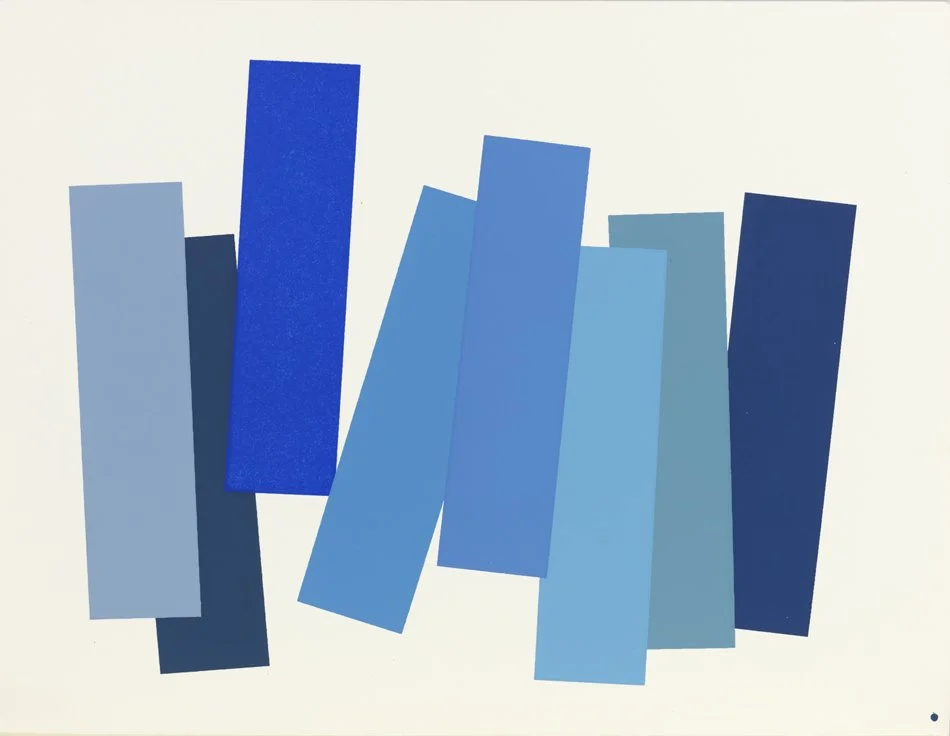
Plate V-3, from Interaction of Color, Josef Albers
The (BLUE) Fabric selection and my ‘scientific method’
I honestly put much less thought into fabric selection than I normally do. I did not use my handy Color Tool at this stage (I may have referenced it at some point in the layout). I chose every fabric that a person might consider “blue” when they viewed it in isolation.
Some fabrics leaned steely and gray, while others were aqua or even minty green. There were straightforwardly blue shades as well, like navy and cobalt. The only reason there weren’t more purple-tinted blues or violets was because the designers had yet to include many of those in their collections (and I had already used those fabrics in other projects).

Were I truly one of Albers’ students, perhaps I would have started with the center and worked my way outwards, using my instincts and mental state to evaluate the interactions between shades and tones of blue and the light they stole and reflected back to one another.
Instead, I employed a little experiment that would yield a complete surprise of a quilt! …and then I could evaluate the context of colors and their interaction post hoc, and pretend that I understood color theory all along. Such is the La Bizarra way: fly by the seat of my pants, but if I succeed? Why, it all went according to plan! I absolutely meant to do that.
“Every perception of color is an illusion...we do not see colors as they really are. In our perception they alter one another. ”
My “careful deliberations on color theory” went like this. Step one, organize the print fabrics from light to dark, regardless of hue (this is where the Color Tool actually did get some use. The Color Tool helps you identity the relative value of different hues).
Step two, I organized the solid fabrics from dark to light. Then step three, I cut all my half hexagon shapes, top half and bottom half, from the print fabrics and the triangle shapes from solid fabrics, keeping my careful order. That’s it! That was my very artistically sound, deliberate, theory-driven technique. I am clearly a genius.
In the end, it was all about trust. Trusting the color genius of the fabric design team behind these prints, trusting the process of play and experimentation, and trusting that my uncle’s primary hope for the quilt was that it be BLUE.
Step One: organize print fabrics from light to dark
Step Two: organize solid blue fabrics from dark to light
Step Three: cut all my half-hexagon shapes from the print fabrics, keeping my careful color order
Step Four: cut all my triangle shapes from solid fabrics, keeping my careful color order
Step Five: TRUST
Quilt Layout and Piecing: Achieving an ombre gradient
And Voila! It looks like sunlight shimmering through water or shimmering fish scales. I achieved the shimmer by placing my blue print half hexagon shapes (light to dark) down the quilt, and placing the blue solid triangles (dark to light) down the quilt alongside them. So reverse blue ombres work together to give a lot of movement to this basic traditional set of quilt shapes.
And just like I carefully planned (ha!), the blue shades interact with one another in a magical way that, as Josef Albers said about the purpose of art, doesn’t represent nature, it re-presents nature. (He gets it.)
I especially loved the point in the middle of the quilt where the two ombre gradients converge in a similar mid-value blue sea, before continuing again on their divergent paths. The bottom of the quilt is the churning of a gathering wave, the top of the quilt is the foamy whitewash after it has crashed. The middle of the quilt is the glassy curl for your eye to surf through.
“The purpose of art is to re-present nature, not represent it. ”
For any gradient quilt, a design wall is the most helpful tool, in my experience. As my studio is currently in a garage, I do not have any lovely layout process pictures (bad lighting). But I used a Cheryl Ann’s portable felt design wall, which has been very handy as it is easily broken down and moved out of the way when necessary. And it’s also portable enough that I can take it with me on sewing retreats or sew days away from home.
I laid out my competing ombres on my design wall, then could rearrange ever so slightly (so as not to disturb the results of the original color experiment too much) to make sure identical prints were spread evenly across the quilt, and did not end up adjacent. Oh, the horror of an accidental adjacency!

Finishing Touches and a Mermaid-Worthy Photo Shoot
I had intentions of taking photos of this lush gradient quilt with a mural in the background, but I happened to be meeting a friend for lunch in Oceanside and walked through the Oceanside City Hall complex. Wow! It’s straight out of the Little Mermaid! King Triton’s palace, a mosaic fountain, and there’s even a little grotto near the entrance to the city library.
The outdoor glamour shots were taken of just the quilt top/flimsy, before the quilting and binding turned it into a real quilt. Keep scrolling to see the luscious final product.


I am so glad I undertook to test this pattern for Hayley, and I hope I gave her some useful feedback so others can create their very own Gondor quilt.
Since my fabrics and placement were ever so modern (although, I hope my uncle can appreciate the fun retro aesthetic of the prints), I stuck to a more traditional style of free motion quilting design, covering this bed quilt in swirly feathery teardrops, to appeal to the aesthetic of its intended recipient, my very patient uncle.
I backed it with a soft sateen sheet in lightest clear water aqua, and framed all that wild color theory action with the Netorious print in a shade of cadet blue (if we use Crayola color names).


look at that sea of texture
This quilt was custom made for my uncle, but if you would like a similar quilt, consider a custom order. I adore gradients, and I love infusing quilts with high concept art theory and inspiration (even if sometimes it’s not until afterwards).


