

June Color Clashing Quilt Palette
Neon as a Neutral: A color clash Quilt palette for June
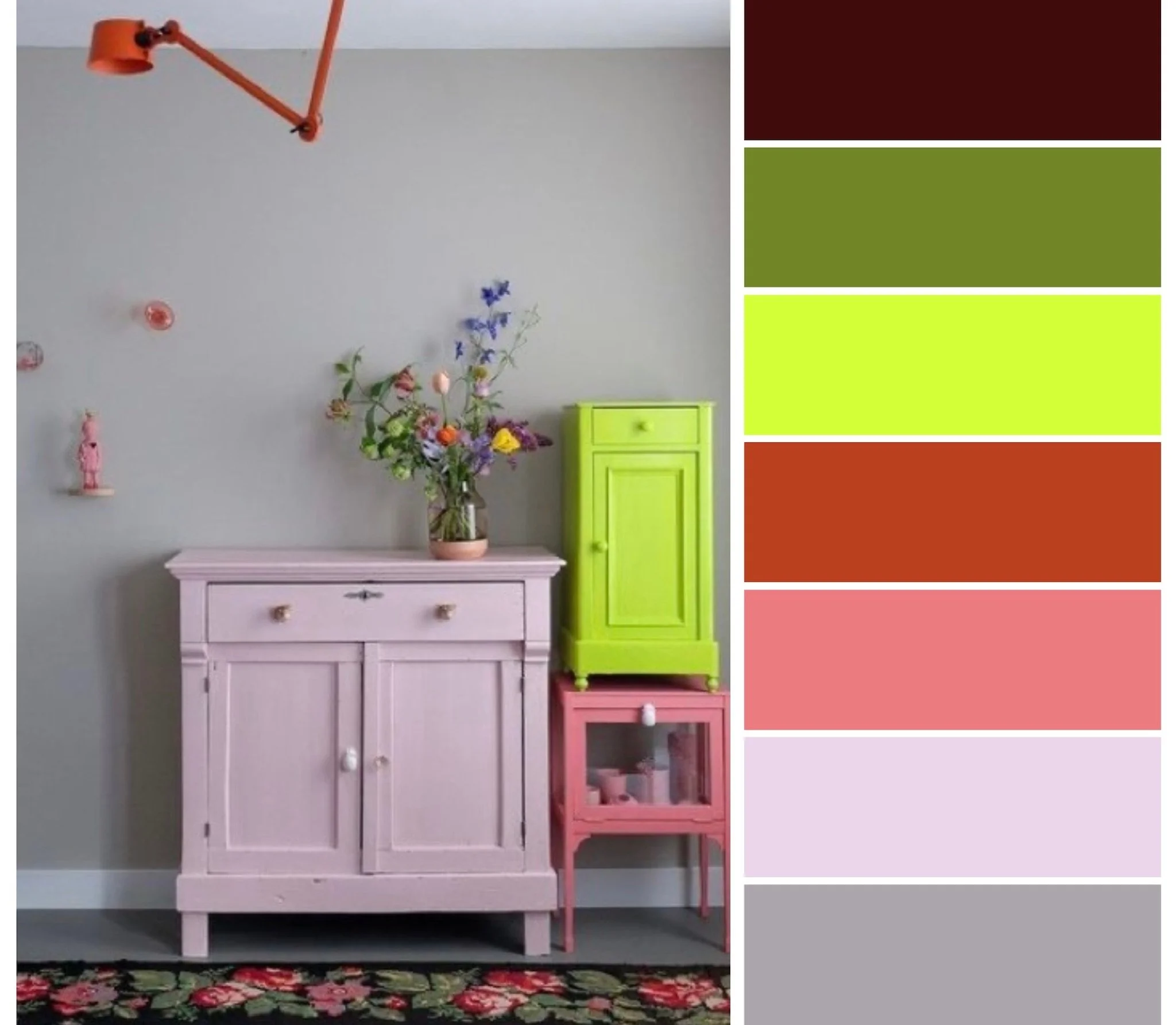
a discordant palette of clashing warm tones with a zip of neon tying it together
June has arrived with a spirited energy, full of early summer abundance and shifting moods (and weather). I had enough of the moody May Gray last with last month’s palette, so I’m leaving California’s June Gloom behind for the chaotic contrasts of June in my new state, North Carolina.
This month, the zodiac straddles the playful airiness of Gemini and the nurturing sensitivity of Cancer, so I’ve captured the duality with a chaotically clashing color palette of warm tones. We’re leaning into both sides of June’s personality (and its temperamental meteorology) with bold contrasts and unexpected harmony: deep cabernet and rusty red hint at earthy groundedness, while watermelon pink and light lavender pulse with vibrant, flirty energy. Silvery gray and olive green feel out of place, until the zip of neon yellow acts like a lightning bolt and melds them all together.
This palette also draws inspiration from the season’s many sensory delights. Perfectly ripe avocados, chilled watermelon wedges, and the sweet scent of honeysuckle, one of June’s birth month flowers. The deepest hue in the palette is reminiscent of a rich red wine or a bouquet of chocolate cosmos.
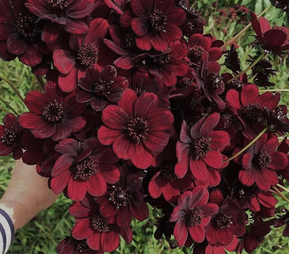
chocolate cosmos
neon is the neutral
I am so intrigued by this combination because it doesn’t seem like they should work (and you very well might think that they don’t!) but to my eye, the neon yellow acts as a neutral, or rather the opposite of a neutral, which ultimately serves the same purpose. A neutral is meant to give your eye a place to rest, so it doesn’t compete with the other colors, but rather gives them space to shine. Neon (so hard to capture over a screen) competes with ALL the other colors, and outshines them all. It’s neither warm nor cool, but more of an electric shock. The other colors are forced to work together to make their softer voices heard.
Whether you're a Gemini with a love for contrast and a penchant for clashing, or a Cancer who treasures comfort and connection, this month’s colors speak to June’s lush contradictions and its generous creative (electrical!) spark.
Palette Picks: fabrics that fit the bill


This month’s palette has a similar electrical storm vibe to the newest Ruby Star Society collection release (due in stores any day now) Glow Garden by designer Sarah Watts. Like I mentioned above, neons are not well served by computer screens, so it’s hard to express how these colors seem to gloooow in real life. Like glow-in-the-dark star stickers on my childhood bedroom ceiling, glooowwww. The icy cool lavender is well represented in these prints, as well as a warm rose and honeysuckle pink color. But the greens and deeper red hues will have to be sourced elsewhere.
I’ve pulled two stacks from my fabric stash, one of blenders and one of bold florals, just to show you how many versatile options could fit the bill with the color clash palette this month. Some of Elizabeth Hartman’s Kitchen Window wovens and Lizzy House’s Pearl Bracelets would make any pattern feel more modern. Rifle Paper Co. has some floral prints that contain just about all the palette colors, save for the neon, which I’ve got in a tiny scattered flower print from Ruby Star Society’s First Light collection.
Of course, I’ve listed the AGF Pure Solids from Art Gallery Fabrics, my preferred solids manufacturer. Pictured above:
Aurora Red
Cabernet
Dusk
Electric Lime
Miami Sunset
Reverie


For modern blenders, the newest color offerings of Ruby Star Society basic collections Starry and Speckled have that earthy olive green, that icy lavender, watermelon pink, and warm cayenne red.


A currently available option from Ruby Star Society is Favorite Flowers, a collaborative collection from all the RSS designers. These colors felt so fresh and intriguing to me when I got this collection, and I can see now that it is because they don’t seem like they should work, but they do. The chartreuse shades in the collection don’t quite hit neon levels, but the color clash is calmed by neutral black, cream and white in the prints.
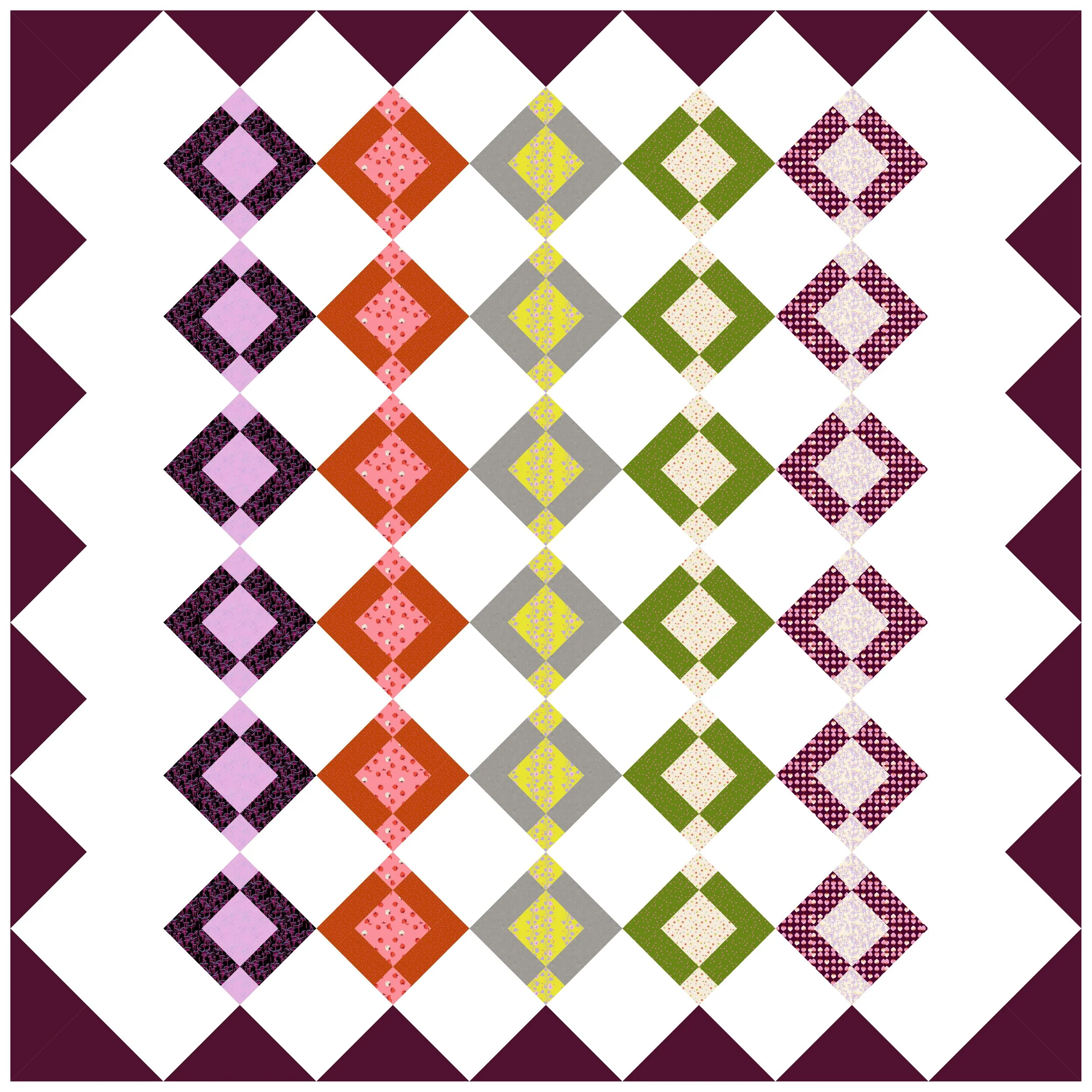
Perfect Quilt for the traditionalist
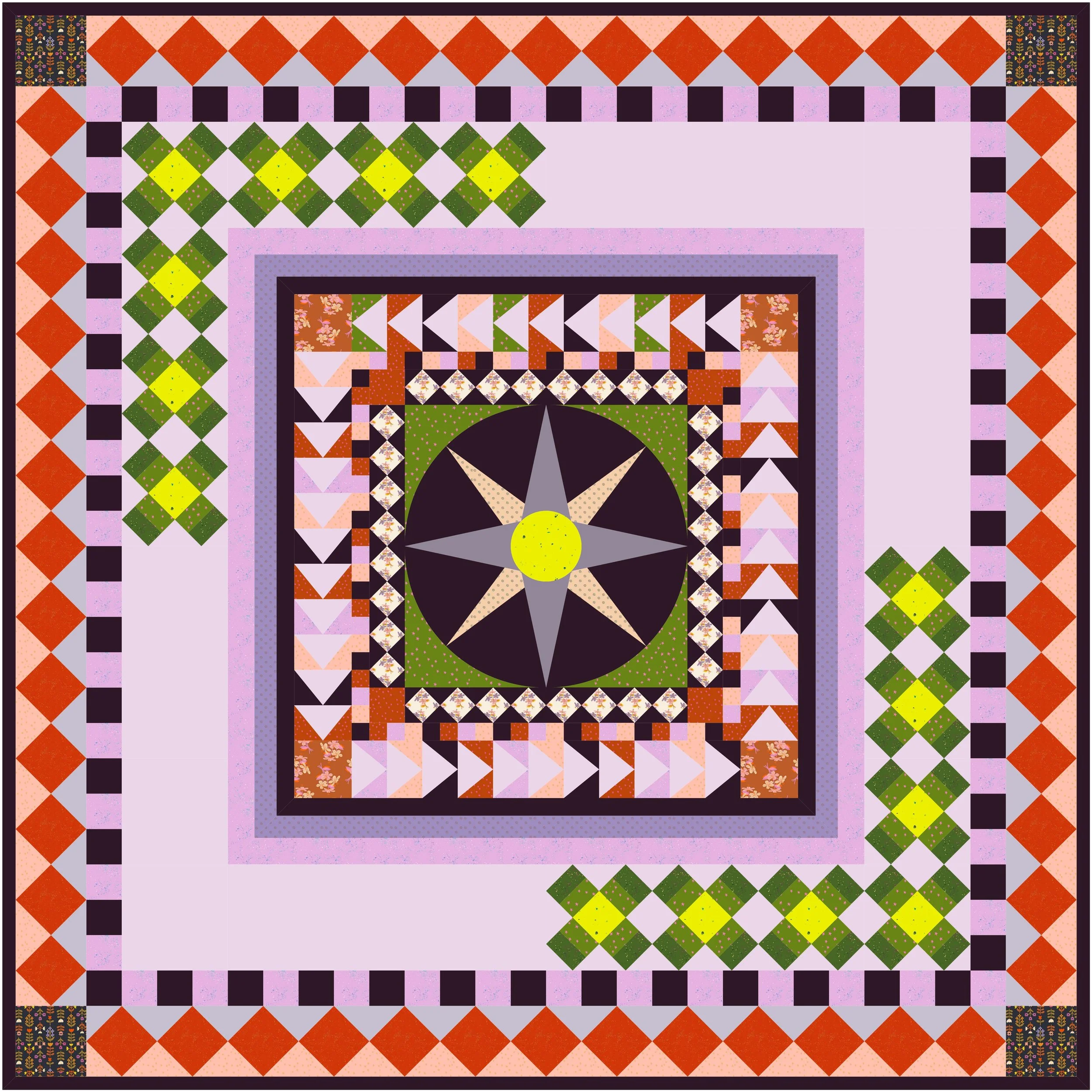
Mariner’s Medallion quilt in June palette
The Mariner’s Compass block is an iconic traditional quilt block, known for its radiating points and starburst symmetry that echo the compass rose on a map, or the navigational tools used by sailors. They go from very simple, with just four points for North, South, East, and West, to very intricate, with smaller and smaller points between the main four. My modern mock-up in this month’s palette keeps it fairly simple and bold, with just 8 points leading out from the bright neon eye at the center of the compass.
Often placed at the center of a medallion quilt, the Mariner’s Compass serves as a dramatic focal point, guiding the eye outward. A medallion is created from added borders around a focal center block. These borders vary in complexity and color combinations, radiating out like ripples in water.
A traditional Mariner’s Medallion might be made in classic nautical blues and creams, or a vintage colonial reproduction palette, maybe featuring Madder Brown, giving it a formal and historical vibe. Making it with modern quilt fabric collections and in bright, modern colors easily gives it a completely different aesthetic.
I’ve used some simple, graphic blocks for my rows/rounds to keep things looking mod and sleek, with a couple opportunities to feature some print fabrics in the cornerstones and in the center of some diamond-in-a-square blocks. I avoided stars so that nothing would distract from the center compass star. There are also some flying geese rounds, a couple of simple checkered rounds, and a round of X blocks that are sometimes called “Mother’s Dream” blocks. I prefer to think of them as fancy ‘kiss’ blocks, like the x’s and o’s that we interpret as kisses and hugs.
To further modernize and sleekify the look, I’ve only filled the X blocks on two corners of a fairly large round. This gives a lot of open negative space for eyes to rest, with a soothing light gray-lavender Reverie solid as the background color.
Symbolizing direction, discovery, and precision, the Mariner’s compass and medallion theme makes this a great modern quilt for a new graduate. With both graduation season and Father’s Day happening this month, it’s an apt tribute. Perhaps you even know a newly graduated Marine or Navy Ensign, or a Marine who is also a father, on whom this navigational symbolism will not be lost.
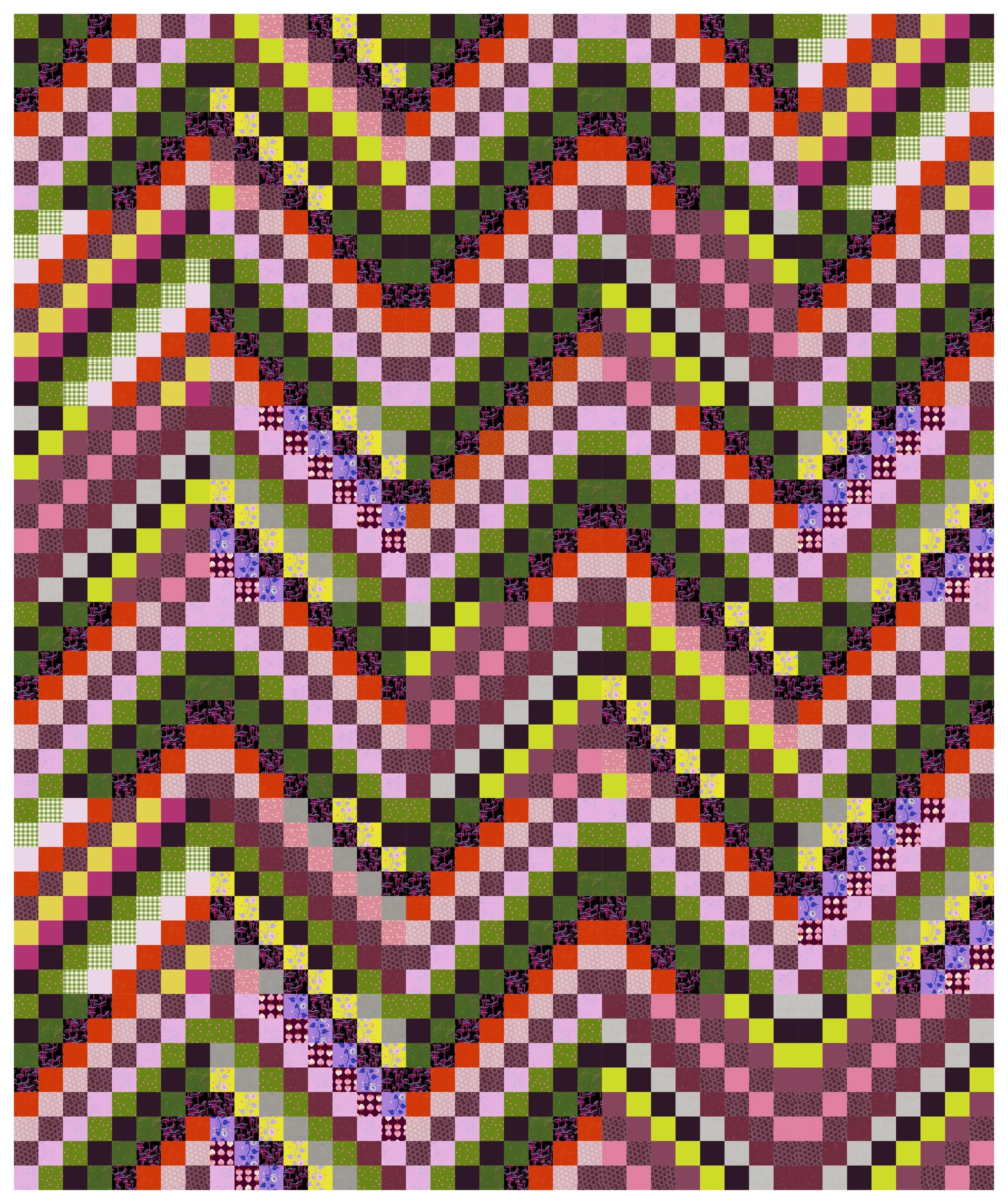
Favorite quilt pick for Maximalists
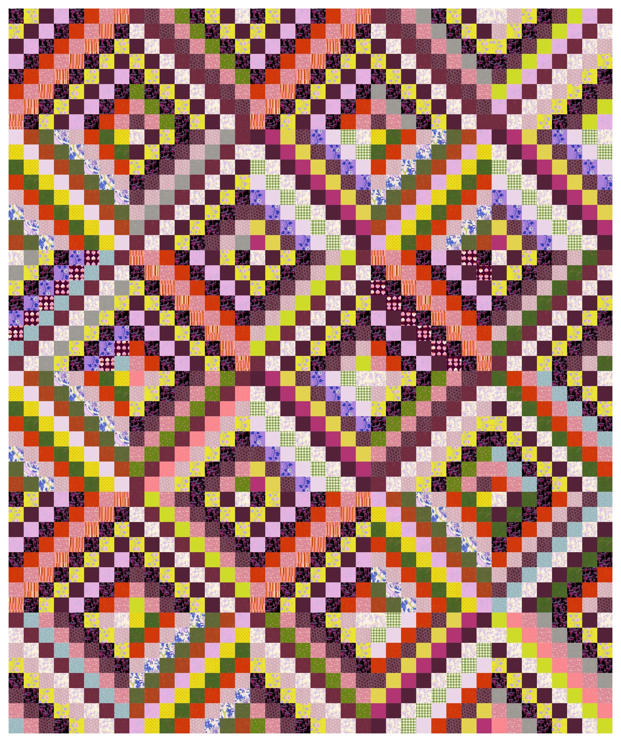
Scrappy Trip Around the World quilt with diamond layout
Will I ever tire of a Scrappy Trip Around the World Quilt? Will I ever stop choosing it as my eclectic maximalism essential? Not this month!
This pattern is pure visual joy, perfect for letting every color in the palette shine and collide in the best way. With its woven effect and movement across the surface, it turns chaos into cohesion. It lets bold prints, understated blenders, high-contrast combos, and unexpected juxtapositions all live together in harmony.
In this month’s palette, the rich cabernet, juicy watermelon pink, and rusty red sit side-by-side with ice cold silver and lavender, retro avocado and futuristic electric neon, and somehow everyone’s happy. It’s loud, it’s joyful, and it has that sense of collected-over-time magic that defines a good scrappy quilt and an eclectic interior aesthetic. If you're a color lover who believes more is more, you’re with me on this one. My favorite suggestion for maximalists each and every month so far.
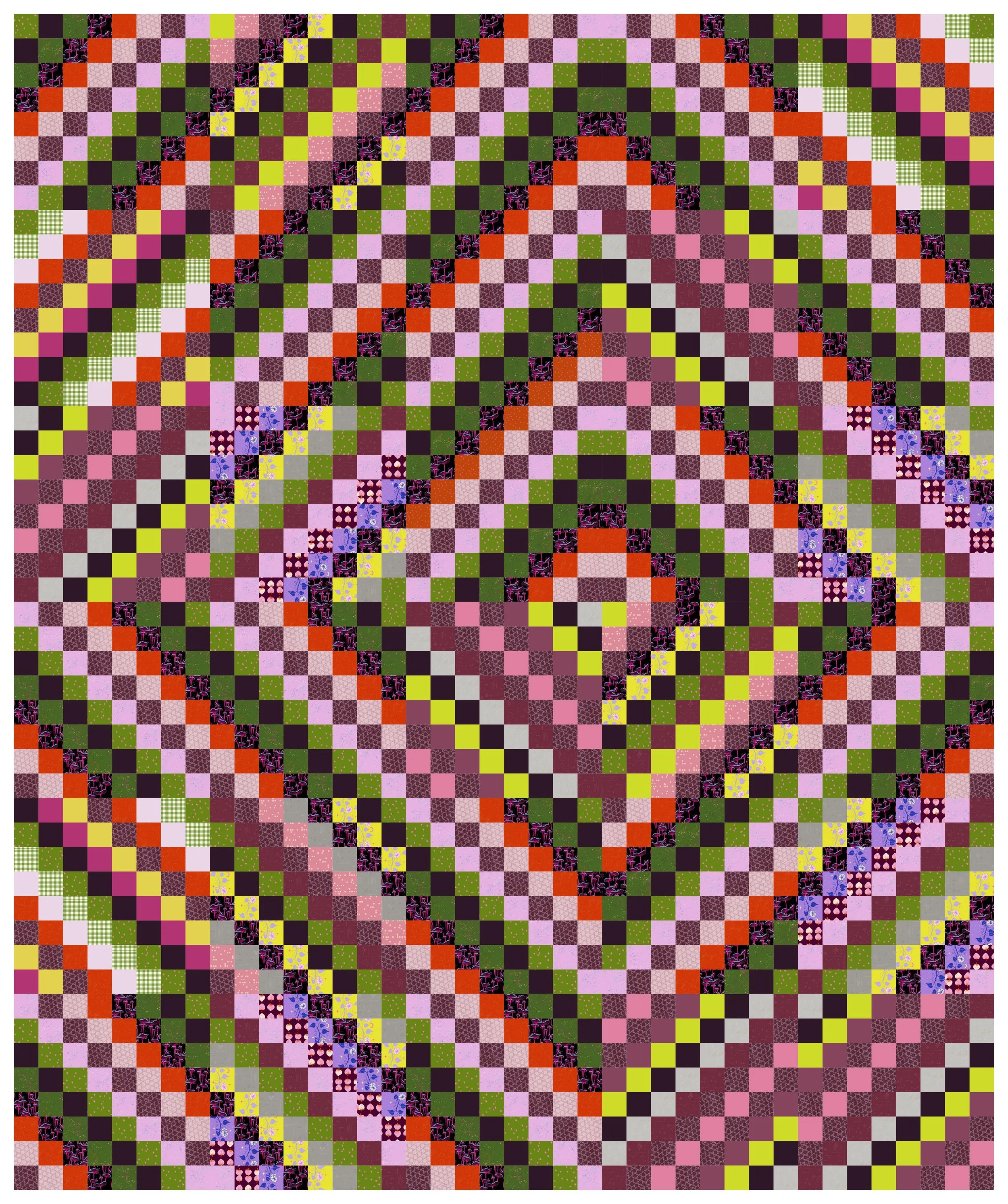
Scrappy Trip Around the World quilt, chevron/ripples/Missoni-knit layout
Although I stuck with my favorite Scrappy Trip Around the World quilt for last month’s palette, I did attempt to mix it up with a new layout. I placed them in a ripple because of the coastal inspiration of the palette, and it triggered a memory for me of an amazing Missoni knit dress that I briefly owned through a clothing thrift swap. So this rippled layout is now the “Missoni-knit layout” in my quilt lexicon.
It is even more Missoni-coded in this color palette because Missoni knits are often in complex and clashing color palettes as well.
Scrappy Trip Around the World, radiating diamond layout
And just to further demonstrate how versatile this basic Scrappy Trip quilt block is, yet another layout, this one radiating out from a center diamond. With the tiny fabric squares giving a pixelated quality, it almost looks like a real-time weather map, perhaps warning you of a summer storm, or tracking the eye of the hurricane.
Perfect Quilt for a Dream Dorm Room, Extra Long Twin Size
The Kelly Quilt mock-up
The Kelly Quilt by Erica at Kitchen Table Quilting is my pick for an ideal dorm quilt in this month’s palette. My mock-up varies from the pattern, as the columns are offset from each other in the pattern, but I didn’t want to make an exact replica, since it’s not my pattern. But I do have a copy of this pattern, and have made a few quilts from it before. It comes together quickly, and is a lovely way to pair up complementary fabric colors or prints.
The most dorm-friendly aspect of The Kelly Quilt is its size. The twin size finishes at 71 inches by 99 inches, a generous size for a twin, plenty of length for a Twin XL bed (a dorm room staple), and long enough for even the tallest of college students. To hear more about quilts as dorm bedding and twin XL sizes, I’ve written a lot about it in this dorm bedding guide.

A generously-sized Twin XL quilt made from the Kelly quilt pattern
For my mock-up in the June color palette, I’ve featured some prints from Kim Kight’s Strawberry fabric collection, which I’ve rhapsodized about at length here, as well as the Moon Vines print from Glow Garden, in the cool lavender color and the bright neon yellow color. I love the way the columns of blocks mimic the climbing flower vines in that print.
Classic quilt style, modern palette
Flowering Snowball or Spotlight quilt in June color palette
The Flowering Snowball looks so modern to me, probably because of those gorgeous wide curves. But like most quilt blocks and techniques and patterns, it has been around longer than I have. According to the Encyclopedia of Pieced Quilt Patterns, by quilt historian Barbara Brackman, it has been around since at least 1965, when it experienced more widespread popularity after being published in the pattern magazine Aunt Kate’s Quilting Bee.
I love to use it to show off color groupings in those stretched taffy four-patch blocks. You can completely change the look of the quilt depending on your use of color in the four-patch blocks and in their melon-shaped counterparts.
Here I’ve chosen to group the palette’s colors in the four-patch blocks, which I sometimes refer to as the shields, and leave the melon-shapes as background. The color I’ve chosen matches a natural linen as the background. But notice, I’ve used some light colored print fabrics and a bright white solid in some of the melons. This acts as a spotlight for some of the shields, and gives it a bit of modern dimension and interesting perspective.
With the difficulty of properly showing neons through a computer screen (fickle pixels!), this reads a bit more yellow than intended. With yellow instead of neon, those icy blue-lavender shades are what comes through strongest and those blocks become the stunners. But if you can imagine the yellows looking more like a highlighter, or a glow-in-the-dark sticker, you can see that they electrify the whole quilt, making it super bold and current.
La Bizarra Pattern Pick: Summer Shower Quilt

The Summer Shower quilt in June palette
I always love to showcase the monthly palettes with one of my own patterns, and I’m so excited because I have a new pattern available later this month, the Summer Shower quilt.
This pattern is very La Bizarra with its fat, wet raindrops rendered in cozy, dry fabrics. I love the weird, the silly, and the ironic. Little white highlights on some of the larger drops give them dimension and a cute round shape and the illusion of a natural light source reflecting off of them nearby (a bolt of lightning, perhaps).
It also enhances their 8-bit computer or video game aesthetic. These are from a storm that might waylay Link on his quest for Zelda, or might set you back days on the Oregon Trail.
I designed it to feature the Glow Garden fabric collection with its cool icy tones and zippy neon yellow, but it works well with this earthy, clashing June palette as well.
I’ll also put in a quick plug here for my newsletter, so you can be the first to hear when the Summer Showers quilt pattern and all new patterns are released.
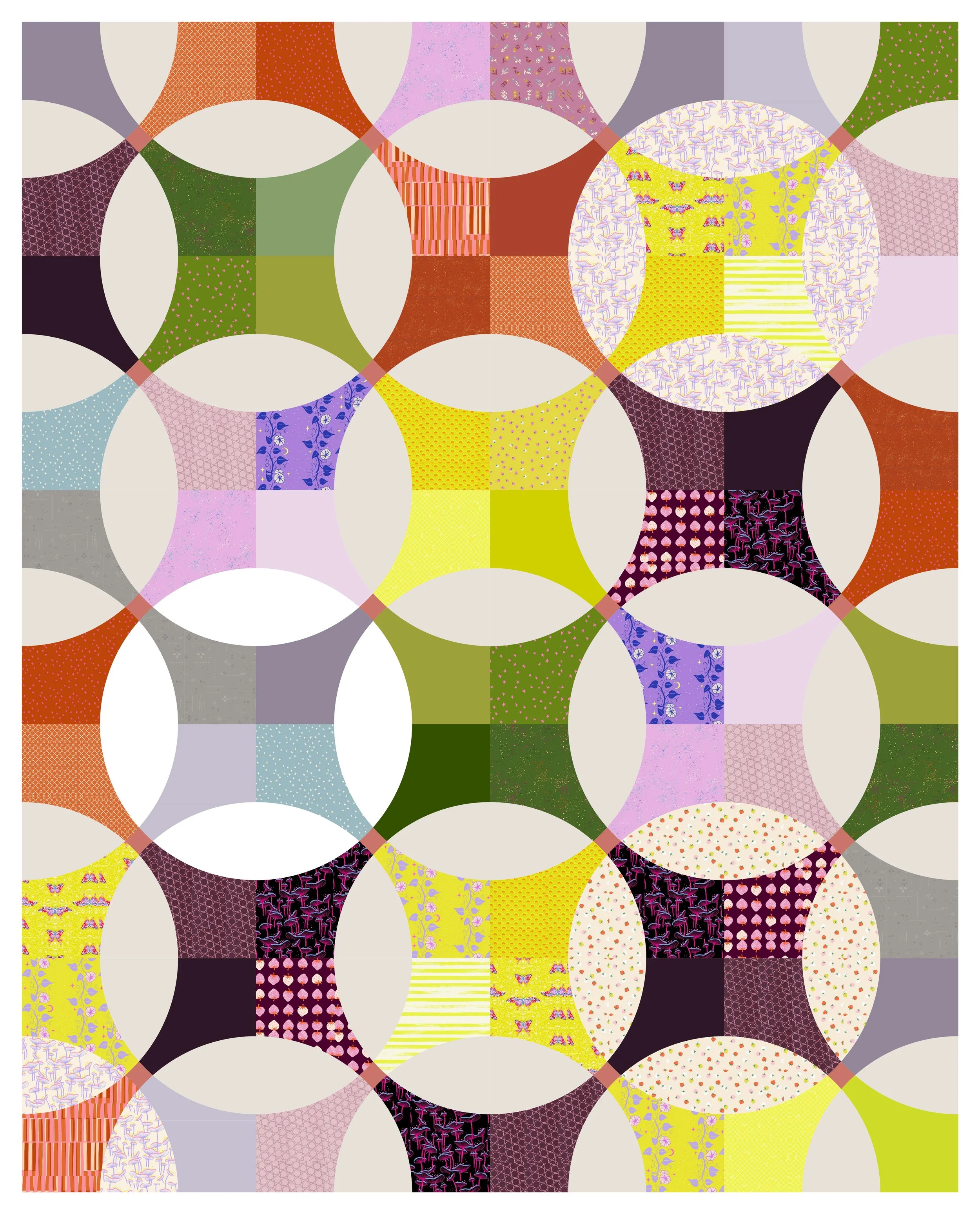
Nature Inspired Quilt Option for Abstract Expressionists
I love to include a minimalist option in my monthly palette mock-ups, but I rarely make minimalist quilts. I have been making many nature-inspired quilts lately though, like this custom quarter circle quilt, so I decided to include a nature-inspired option here. When combined with this particular color palette, this curvy beauty looks like an abstract modernist moonscape, reminiscent of a Kandinsky work.
This quilt takes the classic Drunkard’s Path block, typically a quarter circle, and transforms it into an abstract expressionist homage to the natural world. With smooth curves and shifting combinations, it feels like the phases of the moon or the gently drifting shadows under a tree as the light filters through leaves. The June palette amplifies this connection with the muted reds and greens of clay earth and foliage, while lavender, silver grey, and blush pink sparkle as though moonlit. The neon yellow and deep cabernet bring unexpected sparks and necessary contrast to balance out the otherwise conflicting colors.
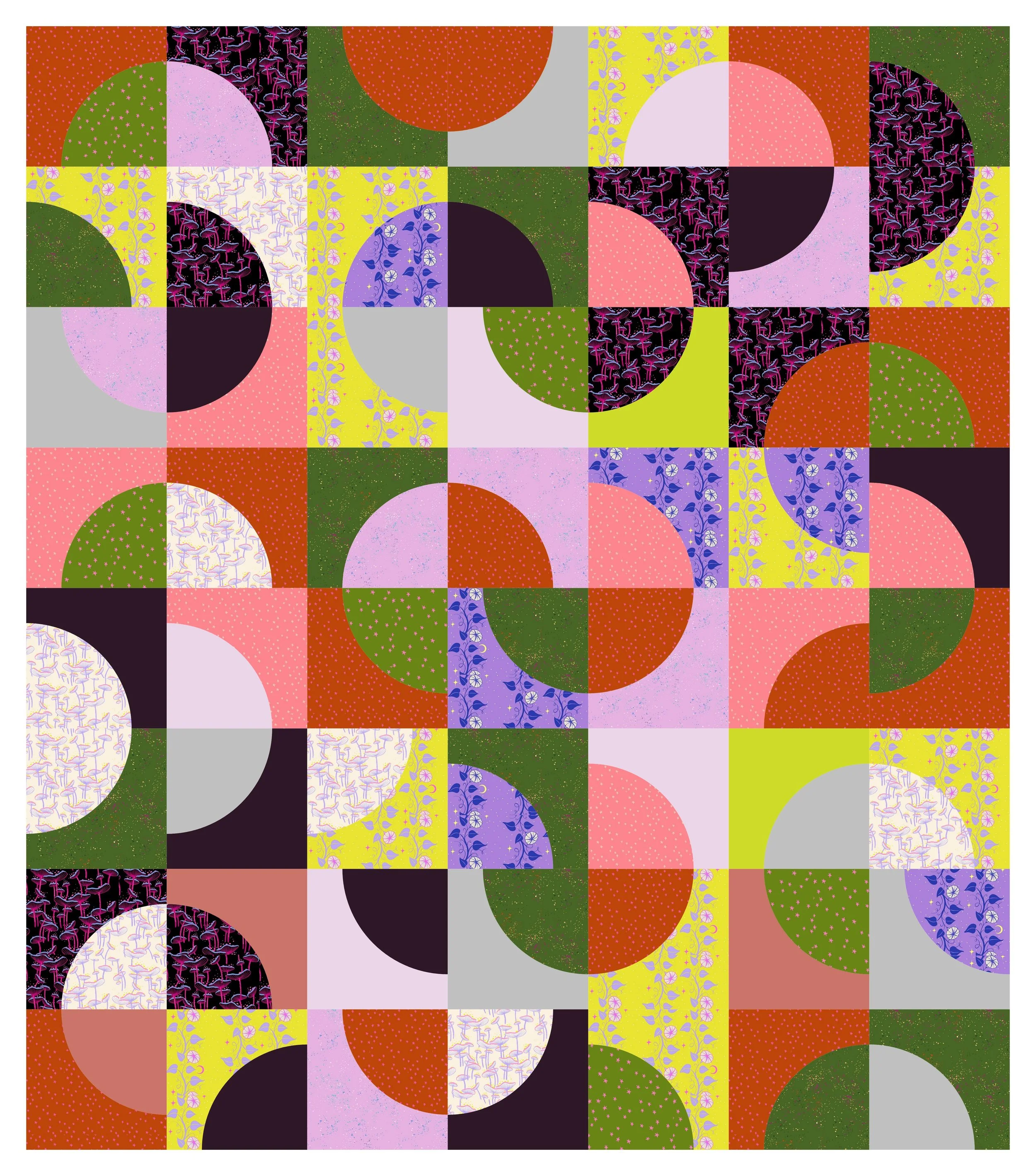
Modernist Moonscape quilt
With just simple rotations of one basic block, this quilt manages to give modernists a structured yet fluid design that plays with symmetry and spontaneity. And with just a couple different shades of the 7 hues of our palette, we’ve played with shifting light for a more glowing effect. Your eye moves about, caught on the vibrant shades that appear lit from within.
It called to mind a painting by Wassily Kandinsky, Circles in a Circle.

Circles in a Circle, Wassily Kandinsky, 1923, from Philadelphia Museum of Art
This quilt celebrates the imperfect geometry found in nature, where circles are never quite perfect and colors are not static, but constantly interact with both each other and the light around them.
color clash or unexpected aesthetic harmony?
This month’s palette isn’t for everybody. It’s a little unruly, chaotic, full of tension and a buzz of static electricity. Not everyone is drawn to power clashing, or considers neon a neutral, but that’s part of the magic for me. This dissonant combo has been an invitation for me to play and experiment outside of my wheelhouse. Except for the neon; neon is a fixture in my wheelhouse, and this palette exploration has only further affixed it there.
Whether you lean into the power clash aesthetic or maybe reinterpret it into something more serene and subdued, I hope I’ve offered you something here to spark a fresh creative direction.
The robots in the computer suggest the following posts…


Or you can explore other posts on the blog.