

July Larkspur Quilt Palette
flowers are quiet fireworks: Blooming July Color Palette

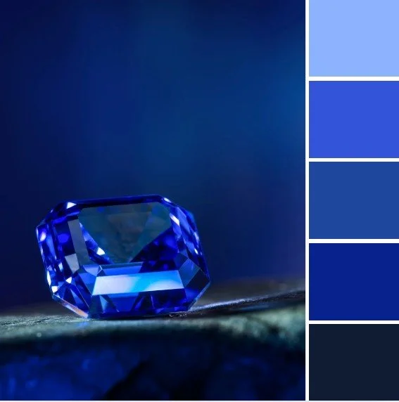
A summery color palette using nature’s fireworks: July flowers
Bold, bright, boisterous, buoyant. July’s quilt color palette is a celebration! (brought to you by the letter B, apparently) The fiery energy of fireworks balanced by cooling shades of sky and bloom, create a palette with an enduring style that extends well beyond a single summer holiday.
This month’s mix combines ruby red and apricot with rich cobalt and dreamy hydrangea and larkspur, all grounded by crisp white. Together, these colors conjure the full spectrum of the deep summer’s sensory offerings: sizzling heat, blooming flower fields, popsicle-stained lips, fuzziest peaches, puffy white clouds.
Lest you think I just updated a typical red, white and blue palette, I actually relied heavily on the symbolism of July. Red is of course a nod to the month’s birthstone, the fiery ruby, a symbol of passion and vitality. The blend of reds and oranges pay crabby tribute to Cancer season, while also hinting at the bold charisma of Leos, who burst like flames onto the scene in the latter part of the month. Larkspur and hydrangea blues and purples honor July’s flowers, one tall and graceful, one lush and voluminous. Cobalt and white call to mind endless skies, cold lakes, pool days, and sun-bleached linens. And that juicy apricot-peach color? It’s about stone fruits. Literal apricots and peaches. Not symbolic, I guess. Just delicious.

With each of these mock-ups, I worked hard to ensure that the July firework energy showed through loud and clear, but that the main inspiration was drawn from the natural world. Because flowers are nature’s fireworks, and they’re even better because they don’t scare pets with loud noises, and they have a ‘fragrance’ rather than a ‘burning stench’.
Palette Picks: fabrics that fit the bill


This month’s palette has a bouncy berry vibe, perfect for featuring some of the wide array of delicious colors from Ruby Star Society’s recently released collection Strawberry by designer Kim Kight.
Then I checked out some of the new offerings from Art Gallery Fabrics Cur8tor, their curated mini-collections, like these Scandinavian style prints from the mini-collection Modernista. As usual they also had a great selection of Decostitch, my favorite of their basics, seen here in Orchidberry, Peach Whisper, Apricot, and Sunburst.
Of course, I’ve used several AGF Pure Solids from Art Gallery Fabrics, as well. Pictured above:
London Red
Apricot Crepe
Purple Pansy


For modern blenders, the newest color offerings of Ruby Star Society basic collection Starry include:
Ladybug
New Peach
Vintage Blue
Witchy


A currently available option from Ruby Star Society is Salutations, the most recently released collection from designer Rashida Coleman-Hale. The postage stamp prints offer ample opportunities for fussy cutting, and the quirky floral prints are in just the right violet and cobalt floral shades for July’s palette.
Perfect Quilt for the Modern traditionalist: Classic with Flair

July Medallion quilt: Larkspur and Rubies
A sweltering Sunflower Sun block makes up the round center of this modern medallion quilt that I’m calling the July Medallion (where do I come up with these creative names???).
The whole July team is represented here. Ringed around the sun are fuzzy peaches, represented by square-in-a-square diamond blocks. At the corners are violet and purple Priscilla Striped blocks, standing in for hydrangeas and…well, violets.
A checkerboard border with white and intense blue-violet feels modern with its high contrast, and is a fun graphic element with just the right bouncy energy I’m aiming for.
Cross Roads blocks in an array of apricot and orange-leaning reds give the bejeweled look of rubies, and bring the heat of the central sun all the way out to the largest and outermost border.
Garret Windows (a variation of Attic Windows) is a quilt block that uses color placement to give a 3D window frame effect. With the light background and dark violet color placement here, the long thin shape of a larkspur flower is emphasized. When they’re all placed in the same direction on opposite corners of the quilt, as above, they look like a field of larkspurs bent from a strong breeze out of the east.
A traditional medallion quilt is built from increasing borders around a central (often round) quilt block. I find that making these borders asymmetrical is a quick and easy way to give it a modern makeover. Here, I have a border made up of half rubies and half larkspurs, each on opposing corners, rather than making each half a mirror image.
I’ve also used a couple of crisp white plain borders to give an airy, modern aesthetic. Lots of negative space, and especially white, gives your eye some rest and gives the other bold, graphic elements room to breathe.
I love learning the original names and origin stories for traditional quilt blocks, and bringing them in line with more modern styles is a fulfilling way to pay homage to all the quilters who came before me, while still finding my own new paths through our shared craft.
Favorite quilt pick for Maximalists: String Quilt Event Horizon

String quilt blocks in a radiating diamond layout
Wait…did I choose something other than a Scrappy Trip Around the World quilt for my maximalist suggestion this month? Who even am I?
This month’s pick for maximalists is a Scrappy String quilt arranged in a dramatic radiating diamond layout. A sparkling firecracker of color and movement. Strips of ruby red, cobalt, hydrangea, apricot, and snow, in the full variety of prints and solids, collide and shimmer like kaleidoscope shards, making this quilt feel lively, expressive, and delightfully over the top.
And yet, beneath the bold look is a surprisingly minimalist ethos: it’s a celebration of making do with what you have, using scraps and leftovers to create something entirely new and surprising. It’s maximalism with a conscience; because we don’t actually need to buy more to make more (something I could use more reminders of). In that way, it aligns beautifully with both the sensory richness of summer and the satisfaction of mindful making.
I considered arranging these fabrics in color groups, to give that fractal explosion effect a sense of order and dimension. But, in the end, I decided to follow my maximalist instincts and the general principles of both ‘scrappy’ and ‘eclectic’. The brief for this aesthetic is MORE IS MORE and DON’T OVERTHINK IT. While the look requires curation, I think the real magic is when the balance of curation to chaos leans a little too far towards chaos. That’s where the little thrill that comes from being at the top of a roller coaster kicks in.
“More is more.
Don’t overthink it.
Lean towards chaos.”
Perfect Quilt for a Dream Dorm Room: A Fire and Ice Gradient

Cool-to-warm Fiery Icy gradient quilt mock-up
A simple block (I call it the backslash, although it surely has a fun traditional name, too) in a saturated gradient is my pick for an ideal dorm quilt in this month’s palette.
Starting in the top left with the juicy warm hues, the fabrics simmer with leftover summer energy. As your eye moves across and down the quilt, those fiery colors melt into violet and cobalt, before extinguishing the flames in cool near-black navy on the bottom right. Like a sunset fading into night, or summer chilling into autumn and winter.
The structure is minimal, but the impact is BOLD. These super saturated colors are carefully arranged in a gradient that flows and blends, giving the whole piece a sense of movement and mood shift, rather than seeming like the block-based patchwork that it actually is. It is high contrast, but not sharp or crisp. It is a modern, graphic statement piece for people who think (who know!) that opposites attract.
The most dorm-friendly aspect of this particular quilt is it’s size and value. This is one of the patterns available as a choose-your-own-quilt-adventure Semi-Custom quilt. These are quilts that are about 65” x 80” which is a great size for a twin bed, and also a very efficient size for me to make, which is why I offer them as a special Semi-Custom Quilt listing.
A Semi-Custom Quilt is a small twin that I make to your specifications, but with a limited number of very efficient (for me) pattern options. They’re a less expensive alternative to a completely custom quilt. I describe the process in more detail in the Semi-Custom quilt post.
To hear more about quilts as dorm bedding and the difference between twin and twin XL sizes, I’ve written a lot about it in this dorm bedding guide. This size works for most people, but as you’ll read in the post, there are a few elements of personal preference to consider.

A similar cool-to-warm gradient quilt (in queen size)
Best Quilt for Kid Spaces with Elevated Style

A playful Celebrate Everyday quilt in the July Larkspur color palette
The round quarter circle shapes in the Celebrate Everyday quilt pattern by designer Allison Ramsing feel so bubbly and bouncy to me. The perfect playful spirit for a kid-friendly space, but taken up a notch with this refreshing palette of high-quality textiles in designer prints.
For the wheels, I’ve chosen Speckled fabric in Lindley Blue for that perfect hydrangea color, and for its tiny speckled metallic accents. The metallic says glam and fancy, but the confetti-like speckles say PARTY TIME!
To give it an even more whimsical bounciness, I’ve replaced the Lindley Blue with a different color once per row. I love bringing out the other colors in the fabrics, giving each one its 15 minutes of spotlight time.
La Bizarra Pattern Pick: A Berry Bright Knuffel Quilt perfect for Scandi style spaces

A Knuffel quilt in June palette, basically a huggable field of tulips
I always love to showcase the monthly palettes with one of my own patterns, and though this pattern is full of color, it fits right into a Scandinavian aesthetic in the Knuffel quilt pattern.
Knuffel means ‘cuddle’ or ‘hug’ in Dutch, and is so named because of the way the outer blocks hug the center snowball block. But here, I’ve placed my cool colored fabrics in the diagonal dash blocks and placed warmer colors in the rounded snowball blocks, to mimic the look of an overhead view of a field of flowers (the warm shapes acting as petals and the cool shapes acting as stems and leaves).
I have featured a fun Scandi style floral print from Art Gallery Fabrics’ Modernista collection in the centers of the blocks.
I’ll also put in a quick plug here for my newsletter, so you can be the first to hear when my new patterns are released.
Scandi Style is usually characterized by light neutral tones and soft, muted color, they’re no strangers to a pop of bolder color, especially when it contributes to the overall balance of a room or a composition.
Here, I’ve definitely gone more colorful, but made sure to stick with bright white background and the simplicity and repetition of the Knuffel blocks definitely gives cozy hygge vibes.
Best Quilt for Modern Glam Aesthetic spaces

Larkspur color palette meets the Coreina quilt pattern
This quilt, using the Coreina quilt pattern by A Piece of Quiet Quilts, is all glowing drama and geometric elegance, perfect for a Modern Glam space with Art Deco flair. If you’re surrounded by jewel tones and velvety textures, this quilt is ready to move in.
The nested diamond design provides the radiant heat with the ruby red and fuzzy peach fabrics, over the glowing pool of flowing gradient of blues and purples. This quilt has the most masculine energy of the bunch, but maybe I just mean that it resembles a classic argyle. It’s symmetrical, structured, and commands attention.
What gives this quilt its edge is the way it balances precision and radiance. The symmetry of the concentric diamonds satisfies the eye, while the saturated color shift creates a slow, glowing pulse across the quilt top. This is not a background piece, it’s a focal point. It’s a velvet chaise, a crystal chandelier, a lacquered finish.
A Nature-inspired and celebratory collection of colors and quilts
I didn’t realize it until I created all of these mockups and started writing about them, but this month’s palettes is all about what happens when opposites attract. Sometimes you have complement and cohesion, and sometimes you get chaos and fireworks. From fiery reds and oranges to coolest blues and violets, these colors tell the story of July in all its bold, juicy, slightly feral glory.
Whether you’re drawn to scrappy maximalism, cool Scandi calm, or the drama of a flowing gradient, these sample quilts show how flexible a well-balanced complementary color palette can be.
Are you Team Fire, Team Ice, or Team Opposites Attract?
The robots in the computer suggest the following posts…


Or you can explore other posts on the blog.